
In a world where branding plays a pivotal role in how companies are perceived, Google, one of the most influential tech giants globally, has once again revamped its visual identity. The updated ‘G’ logo, revealed in May 2025, marks a subtle yet significant change from the familiar design that has graced billions of screens for nearly a decade. With this change, Google not only aligns itself with modern design trends but also subtly reinforces its commitment to innovation, user-centric design, and technological evolution. This blog explores the ins and outs of this update, its implications for the future of branding, and what it signifies for Google’s overarching strategy.
The Evolution of Google’s Branding Over the Years
Before diving into the specifics of the new logo, it’s crucial to understand how Google’s branding has evolved over time. From its humble beginnings as a search engine in the late 1990s, Google has seen its logo undergo numerous transformations. Each update has served a distinct purpose—whether to reflect the company’s changing identity, align with the tech trends of the time, or support its business goals.
Google’s First Logo: A Humble Beginning
Google’s first official logo, designed by Sergey Brin, one of Google’s co-founders, was a simple serif font with colors representing the primary palette: red, yellow, green, and blue. This initial design stayed for several years, carrying a playful and simple charm that matched the company’s early identity. However, as the company grew and diversified into multiple services beyond search, such as Gmail, Google Maps, and Google Drive, a more refined, professional look became necessary.
In 2015, Google underwent a major branding overhaul, shifting from the serif font to a sleek, modern sans-serif font known as “Product Sans.” This was an intentional move to provide the brand with a more accessible and versatile look across platforms. The rebranding aimed to make the logo more compatible with the various devices people use to interact with Google’s vast ecosystem. The updated logo was designed to be more fluid and adaptable, signifying a future-oriented Google that was prepared to embrace the digital age.
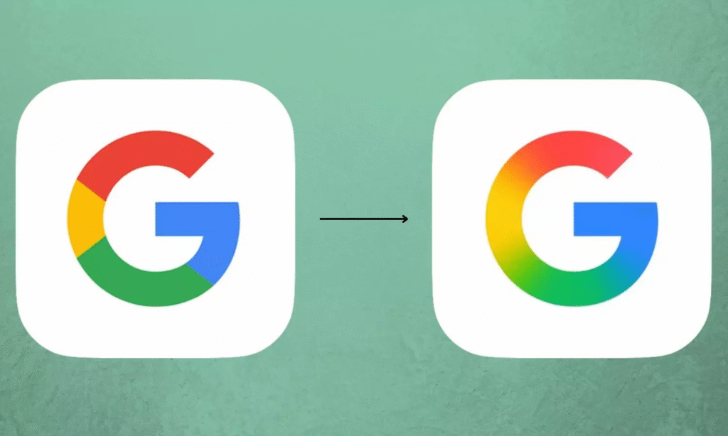
Now, in 2025, Google has yet again updated its iconic logo. The company has added a dynamic twist to the ‘G,’ signaling that despite the consistency of the brand, innovation and the adaptation to modern design aesthetics remain at the forefront of Google’s efforts.
The New Gradient ‘G’: What’s Changed?
One of the most obvious changes in the new logo is the introduction of a gradient color scheme in the iconic ‘G’. The traditional solid colors—red, yellow, green, and blue—are now blended smoothly in a gradient, giving the logo a more modern, dynamic, and vibrant feel. Whereas the previous ‘G’ was defined by clear, individual segments of color, the gradient effect integrates them seamlessly, offering a more polished and contemporary aesthetic.
This change, while subtle, aligns Google’s logo with contemporary design trends that emphasize fluidity, sophistication, and depth. The smooth transition between colors represents both modernity and adaptability, echoing the very core of Google’s mission to evolve with the times.
The gradient effect brings more than just a visual update—it represents the seamless nature of Google’s products and services. Much like how the various Google services—Gmail, Maps, YouTube, and Android—are interconnected, the gradient logo symbolizes the integration and interconnectedness of Google’s ecosystem. Just as the colors in the logo smoothly transition into one another, so too do Google’s various services and platforms, offering a unified experience for users.
A Design Philosophy Backed by AI and Innovation
A significant aspect of the new Google logo is how it aligns with the company’s strategic shift toward artificial intelligence (AI) and innovation. In recent years, Google has heavily invested in AI technologies, including its Gemini AI assistant, and continues to lead in areas like machine learning, cloud computing, and quantum computing. The gradient ‘G’ logo is a visual representation of this leap into the future—much like AI, which is fluid and ever-evolving, the new logo represents Google’s ongoing transformation and commitment to technological advancement.
The design shift also reinforces the integration of AI into Google’s user interfaces and products. The smooth gradient symbolizes the precision and continuous progress that AI technologies are expected to deliver. AI is about removing boundaries and making processes seamless, much like how the new logo transitions between colors without clear boundaries. By aligning the logo with the AI-driven future, Google further cements its identity as a forward-thinking, tech-driven brand that is preparing for the challenges and opportunities of tomorrow.
Moreover, Google’s AI-driven products are gradually becoming more ingrained in daily life. From Google Assistant to predictive search results, AI is an integral part of how users interact with the brand. This rebranding, therefore, is not merely aesthetic—it reflects Google’s broader ambitions to reshape the future of technology and remain at the forefront of the digital revolution.
The Role of Visual Identity in Building Brand Recognition
A brand’s visual identity is crucial for consumer recognition and trust. Over the years, Google has become one of the most recognized brands in the world, thanks in part to its distinct logo. The old Google logo, with its bright, bold colors, became synonymous with internet searches, innovative products, and the company’s overall commitment to improving people’s lives.
The gradient update is a smart move that maintains Google’s recognizable identity while modernizing it for the present era. Unlike other tech giants that have stuck to rigid and unchanging logos, Google’s ability to adapt and refresh its visual identity has allowed it to stay relevant, and even ahead of the curve. This willingness to innovate and experiment with design is a key reason why Google remains a global leader in the tech space.
Case Studies of Other Brands That Have Updated Their Logos
Google’s decision to update its logo follows a broader trend in the tech and corporate world, where many companies have recently revisited their brand identities. These redesigns often represent the companies’ evolving strategies, their efforts to remain relevant, and their desire to modernize their image in a competitive market. Let’s look at some other high-profile examples of companies that have updated their logos in recent years:
1. Apple: A Symbol of Simplicity and Elegance
Apple’s logo, the iconic bitten apple, has been one of the most recognizable symbols in the tech world. The company has made only a few tweaks over the years, but its most significant design shift occurred in 1998 when Apple introduced its monochrome logo. The clean and minimalist design perfectly reflected the company’s philosophy of simplicity and user-friendliness. Just as Google has updated its logo to reflect the times, Apple has embraced simplicity in a way that still resonates strongly with its global user base.
2. Instagram: From Classic to Modern
Instagram’s logo overhaul in 2016 was a much-debated move. The app shifted from its camera icon to a simple, gradient-filled, minimalist version. This change aligned with Instagram’s shift from being just a photo-sharing app to a fully-fledged social media platform, integrating stories, videos, shopping features, and much more. Instagram’s new logo embraced the modern, mobile-centric design that reflects the evolution of how people use the app today. Similarly, Google’s gradient ‘G’ logo signals a step into the future of design and technology.
3. Pepsi: A Consistent Yet Evolving Brand
Pepsi has undergone several logo changes over the years, with the most notable occurring in 2008 when it revealed a new logo design that was cleaner and simpler than its previous version. The change wasn’t just aesthetic; it symbolized Pepsi’s move towards becoming a more contemporary brand, with a focus on being globally recognized while appealing to younger, more diverse audiences. Pepsi’s efforts to modernize while keeping elements of its heritage resonate similarly to Google’s recent update.
These case studies highlight that logo changes are not just about fresh aesthetics but are also deeply rooted in a company’s evolving goals, strategies, and audience engagement. Google’s gradient logo is following in the footsteps of these other brands that understand the power of design in shaping perception and staying relevant.
Breakdown of the Design Process: How Google’s Team Created the New Logo
The process of redesigning a logo for a global tech company like Google is a complex, iterative journey. It involves a deep understanding of the company’s identity, market positioning, user needs, and technological advances. Google’s design team, which includes experts in branding, visual design, and user experience, worked on this logo for several months before unveiling it to the public.
Step 1: Conceptualization and Ideation
The first phase of the design process focused on understanding the essence of Google’s brand and how to translate it visually. The team studied Google’s history, the evolution of its logo, and current design trends. They brainstormed various directions and concepts that would reflect Google’s mission to make information universally accessible while remaining adaptable to a wide range of devices and user needs.
Step 2: Testing and Refinement
Once the conceptual phase was complete, Google’s design team began testing different logo variations. They experimented with color gradients, shapes, and typography, ensuring that the new logo would look equally good on small mobile screens and large billboards. Testing involved both A/B testing with real users and feedback from design experts.
Step 3: Finalizing the Gradient Look
The final decision to introduce a gradient was inspired by the need to bring more depth and sophistication to the design while retaining the brand’s colorful identity. The team carefully selected a smooth gradient that would transition seamlessly between the classic Google colors. The gradient not only aligned with modern design sensibilities but also reflected the seamless, interconnected nature of Google’s suite of products.
Step 4: Rollout and Feedback
After finalizing the design, Google began a phased rollout of the logo. Initially, the logo appeared on digital platforms like the Google Search app and later expanded to other Google services. The feedback from users was carefully monitored to ensure that the new logo was resonating well with the audience.
Insights into Google’s AI Initiatives and How They Influenced the Logo Design
As mentioned earlier, one of the key drivers behind the new logo is Google’s deepening involvement with artificial intelligence. In recent years, the company has invested heavily in AI, with projects like the Google Assistant, Google Brain, and its AI-powered search algorithm.
The gradient in the new logo is a visual metaphor for the fluidity and continuous evolution of AI technologies. AI thrives in environments where flexibility and adaptability are key. Just as Google’s various services evolve and improve through machine learning, the logo adapts and transforms through the gradient, symbolizing the seamless integration of AI into the company’s ecosystem.
The new ‘G’ also aligns with Google’s AI initiatives by creating a more immersive and unified experience. As AI becomes increasingly embedded into every aspect of our digital lives, Google’s visual identity now reflects that interconnectedness. This logo is not just a static design but a living, breathing representation of a company at the forefront of technological innovation.
Predictions on Future Branding Trends in the Tech Industry
As technology continues to advance, branding in the tech industry will also evolve. Several key trends are likely to influence the design choices of tech companies in the future:
1. Minimalism and Simplicity
Brands will continue to embrace simplicity in their logos, focusing on clean, minimalist designs that are easily recognizable and adaptable across devices. Apple’s approach to logo design, with its focus on simplicity, has influenced many other brands, and Google’s new logo follows suit.
2. Dynamic and Adaptive Logos
As brands become more fluid and interconnected, logos will need to be adaptive and dynamic. The gradient ‘G’ logo is a prime example of this trend. Future logos will likely incorporate dynamic elements that can adapt based on user interaction or the context in which they are viewed.
3. AI-Driven Customization
With AI becoming more advanced, we can expect to see logos and branding elements that can change based on user preferences or environmental factors. AI-driven branding will allow companies to create highly personalized and immersive user experiences.
4. Interactive and Immersive Experiences
The rise of augmented reality (AR) and virtual reality (VR) will influence logo design, pushing brands to create logos that work in 3D and interactive environments. This trend will lead to logos that can transform and adapt to new technologies and platforms.
Looking Ahead: The Future of Google’s Branding
As Google continues to innovate, it’s clear that its branding will continue to evolve. The new logo is not just a visual refresh—it is a symbol of the company’s ongoing transformation. By embracing modern design trends and aligning its visual identity with its focus on AI and innovation, Google has reaffirmed its commitment to remaining at the cutting edge of technology. The subtle yet significant change to the logo speaks volumes about the company’s future direction and its continued desire to stay relevant in an ever-changing digital world. As Google moves forward, this logo will serve as a reminder of its journey from a humble search engine to a global technology leader.